Upon receiving the logo, copy, and other information from the client, we were able to bring this website from plan, to proof, to live in 4 weeks. Some of our favorite parts of this project are the custom-designed top header, use of vivid vector graphics, and the project highlights page.
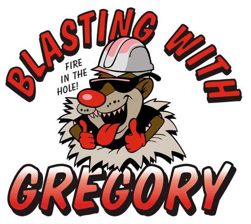
Our design approach was to make the logo the center-point of the website, and build the font choices, color schemes, and illustrated styles around it.
Project Highlights
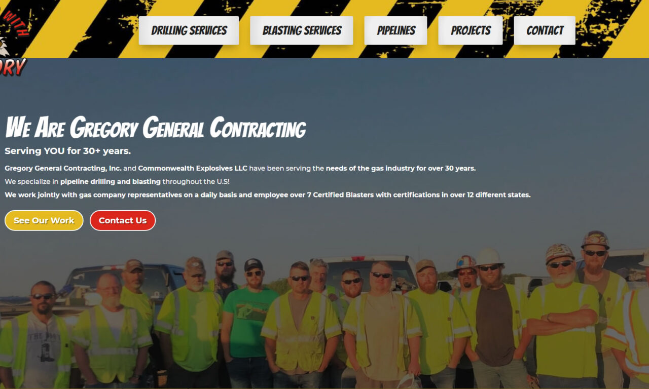
Custom Navigation Bar
The navigation bar on this website incorporates a illustrated background, the company logo, and animated button-style links.

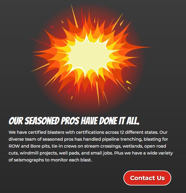
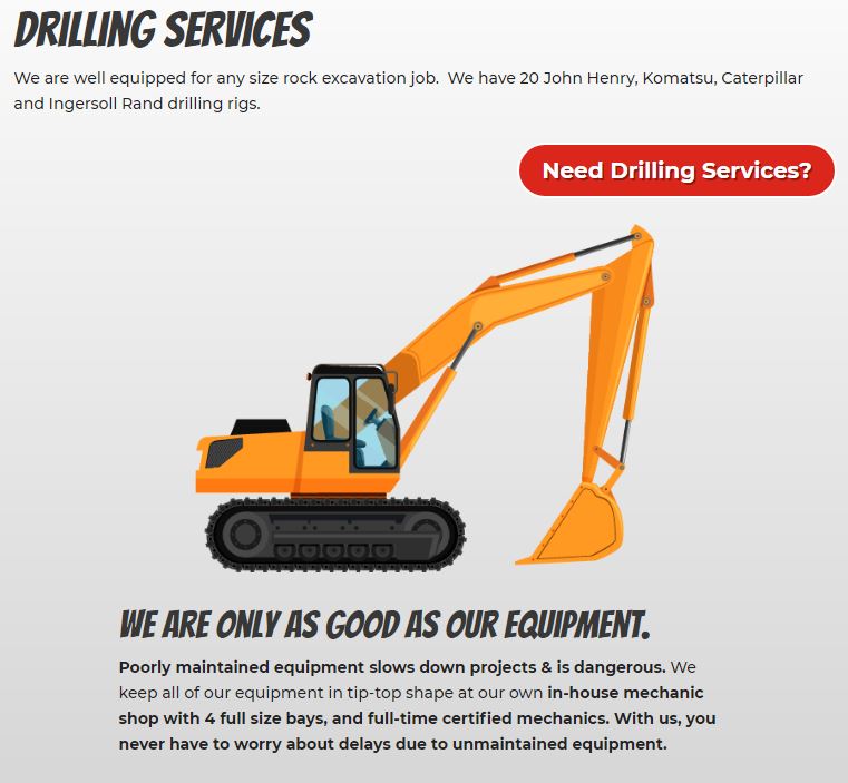
Illustrated Graphics
Vector graphics are a great way to break up the monotony of plain-old photos on a website. They provide a sleek & modern edge to any design. For this website we chose to use “cartoon-esque” graphics to keep with the theme of their logo.
Highlights Page
We wanted to show not just what they do, but what they have done. Thus we provided a page for Gregory General Contracting to post highlighted projects. You can check that page out here: https://www.gregoryexplosives.com/projects/.


